|
|
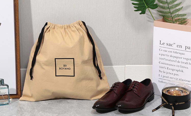
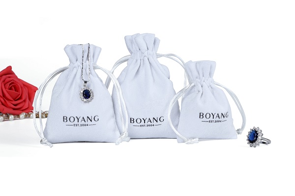
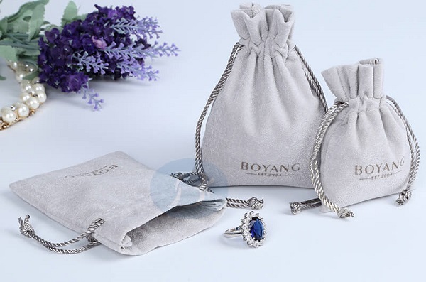
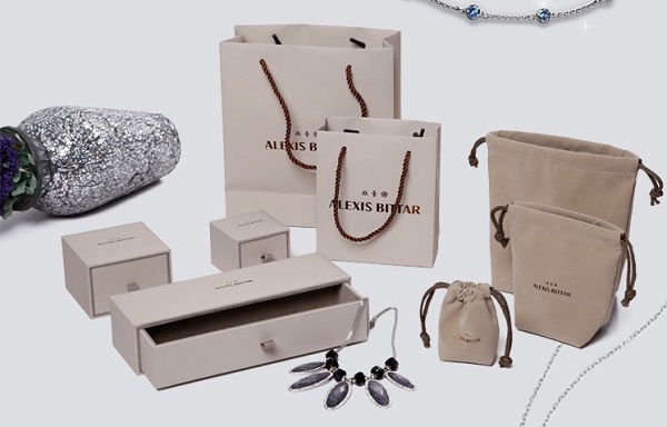
The purpose of custom jewelry bags design fonts is to make characters not only have the function of fully conveying information, but also have the function of product forms and products.People's aesthetic concept achieves harmony and unity.The following principles are generally applicable. (1) To meet the overall design requirements of the custom jewelry bags Custom jewelry bags decoration is the overall expression of modeling, composition, color, fonts, etc., font type, size, structure, performance skills and artistic style must be subject to the overall design, we must strengthen the unity and harmony of text and product overall effect, can not be one-sided Highlight text. 
Custom jewelry bags text is used to beautify packaging, introduce products, and promote products. The artistic image of the text should not only be appealing, but also be able to generate associations and make this association harmonize with the product form and content, resulting in a unified sense of beauty. For example, some cosmetics use a thin thread to highlight the brand name and name, which can give people With a sense of ease and elegance. (3) custom jewelry bags should have a strong visual appeal Including artistic and legible, the former should work hard in arrangement and fonts, requiring beautiful and compact arrangement, sparse and delicate spacing, fresh and varied spacing, appropriate font size, thickness, and certain artistic qualities that can beautify the composition. The legibility includes the eye-catching degree of the text and the reading efficiency. The fonts with poor readability often make it difficult to recognize, weaken the expressive function that the text itself should have, lack the appeal, and cause fatigue. Generally, the number of characters is less, you can work hard to highlight the decorative features; more than the number of characters, should focus on reading efficiency, often use horizontal strokes than the vertical strokes of fine fonts, in order to facilitate the flow of sight in the horizontal direction. 
Custom jewelry bags fonts reflect a certain era, if you can coordinate with the product content, will deepen understanding and association of the product. For example, the use of carcass, bodies, and a strong sense of quaintness, show a long history of the nation, used for packaging of “ancient wine” and “court food”, etc., and for modern industrial products, it is different from the modern sense of the product. At this time, the application of modern and strong fonts, such as isochrons, art characters, etc. is very coordinated. (5) Cannot use too many fonts A packaging image may need several fonts, perhaps Chinese and English, and the combination of general fonts should be limited to three kinds. Excessive combinations can destroy the sense of unity of the overall design, making it seem tedious and cluttered; any combination is required. Stimulation will undermine coordination and harmony. (6) Text arrangement is as diverse as possible The font arrangement of custom jewelry bags is an important aspect of the composition. The arrangement of various fonts makes the composition novel and varied. The arrangement of the packaging text can be considered from different directions, positions, sizes, etc. The common arrangements are: vertical, horizontal, round, oblique, jump row, gradient row, repeat row, cross row, ladder row, etc. Species. Arrangements and diversification should be subordinated to the whole. Words and trademarks and patterns should be coordinated with one another to make them appealing to both the public and the public, both new and common. |
|